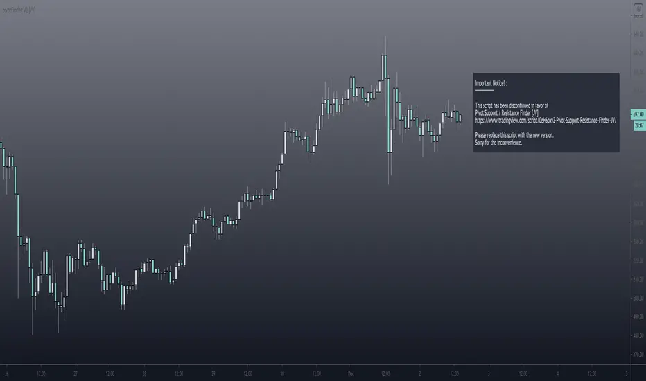
Pivot Support and Resistance Finder [JV] V1Hi Traders.
This is my first attempt of writing an indicator.
Let me start by saying I could never have done this without lmatl and WMX_Q_System_Trading who were and are an incredible source of inspiration.
This indicator shows horizontal Pivot Support and Resistance . It draws up to 4 horizontal lines extending to the right from and adds labels to High and Low Pivot Candles . It also draws the Support / Resistance that is currently forming.
You can select the number of lines on the current timeframe.
There are some options in Settings:
Current timeframe pivot settings
Show and hide levels of the current timeframe
Change colors
Extend Lines
Any suggestions are more than welcome!
I also welcome donations, no matter how small ;-)
In den Scripts nach "horizontal line" suchen
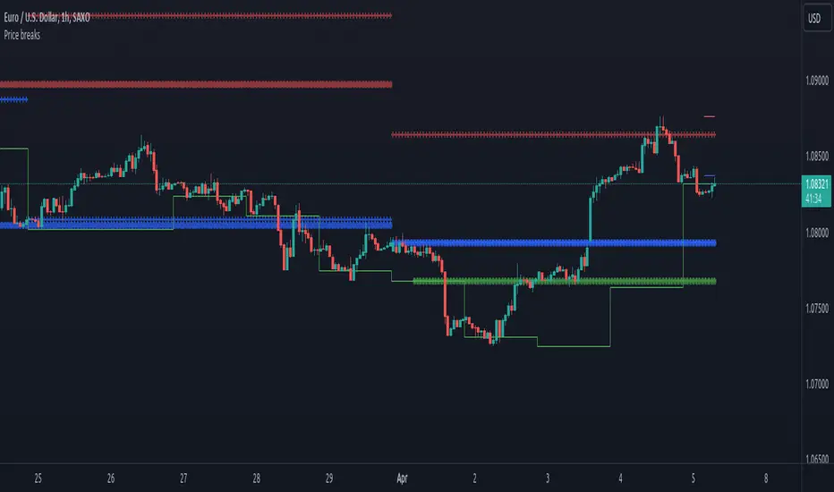
Price breaksThis indicator displays the High/Low/Close of the previous day/week/month as horizontal lines. Of course, everything is configurable but to keep it simple and non-intrusive it only displays:
month's H/L/C levels on D time frame (drawn as circles)
week's levels on 4h (as crosses)
day's levels on 1h (as line)
These levels act as support / resistance over and over again, see current (08/24/2020) BTCUSD chart, the previous month's close (blue circles) did act as support and held on 08/11, also prev month's high (red circles) was not broken on 08/21. Once these levels break we might see lower prices but so far both of them act as good support to consider.
Percent Calculator OverlayFirst and foremost: I'm inspired to publish my scripts by the other member's who publish quality, detailed scripts -a token of my appreciation and support, Thank You.
The percent calculator overlay is an extension of my Percent Calculator indicator that allows one to visualize the percent metrics they're interested in trading: it''s function is to simply output the target price from either the close or ones trade-entry based on a desired percent return on investment (R.O.I.) then plots it on top of the chart as an area plot and notes anytime in the past the desired conditions were met with a {flag "Success"}.
Say you want to profit 15% from your entry: open the settings and plug in your entry value and the number 15 into the appropriate settings and the indicator displays what the target price should be (rounded to two decimal places) right on the chart with the area as well as the horizontal line which is enabled by the "track price" setting.
The percent calculator overlay also goes one step further by finding the average percent return on investment over a desired interval of time (the default is 20 candles) as well as allows one to adjust the size of the price move the average percent return on investment is being calculated for which is displayed on the chart as circles and also displays a horizontal line for the most current value with the enabled "track price" setting.
NOTE: unlike the Percent Calculator the Percent Calculator Overlay creates a visual record of the number of success' the programmed parameters have achieved (based on the closing prices) which self adjusts when the "size of the move" is changed.
Say you want to find the average percent return on investment for a 3 candle swing over a 200 candle interval of time: open the settings and plug the number 200 into the interval setting and the number 3 into the price-move setting and the indicator displays what the average 3 candle swing returns on investment and plots what the target price would be to achieve the average return given the current close (or entry price) with the gray circles and the horizontal line enabled with the "track price" setting.
Practical Application: comparing ones desired return on investment to the average return on investment can help determine how realistic ones goals are... it's unlikely to achieve 100% return on investment if the average is only around 10% (given the parameters one is working within) but on the other hand achieving 5% return on investment is highly likely. By visualizing roughly how often the given parameters have achieved success on the chart one can become a lot more comfortable, confident, and accurate with their goals.
Forward Looking Statement: I believe in the not too distant future plug and play automated trading systems will be made available to the general public. Over the past 4 years we have seen brokers offer free charting software, commission free trading, and now fractional shares; I don't think it will be much longer before we can simply click a few buttons and tell the computer to enter when the stochastic is overbought/sold and exit with a predefined percent gain (and to repeat that process indefinitely). -Imagine the data moving 2-3-4 times a second, the liquidity flowing like Niagara falls, and 95% of the working population not only starting to invest but gains the extra cash flow they desperately need.
Beta testing: please comment or send me a message if you happen to stumble over any bugs or have any suggestions for improvement.

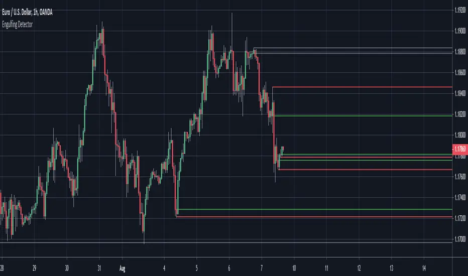
Engulfing Detector (Supply and Demand)Bullish and bearish engulfing candles marked with horizontal lines around engulfed candle.
This indicator can be used to assist in locating potential supply and demand zones.
The fresh zones will be of green and red line colors and the tested zone lines are grey in color.
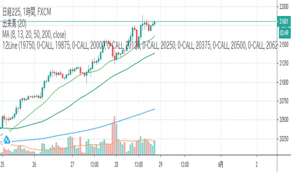
12LineA horizontal line is displayed during Nikkei 225 futures trading to help you draw a line quickly.
If you check the check box, you can display up to 12 lines of 6 types at the entered price.
日経平均先物取引時に水平ラインを表示し、素早いライン描画を助けます。
表示したい価格を入力し、チェックボックスをONにすると6種類の線を最大12本表示できます。
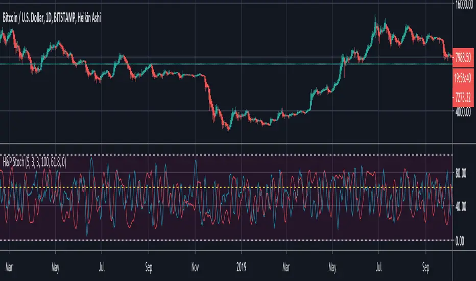
BTC Hash Rate & Price Stochastic IndiciatorFresh off the press, we have a new breed of indicators: Bitcoin's Hash Rate & Price.
As many of you have read, roughly 80% of BTC's price movements can be correlated to its changes in hash rate volume. I decided to make a stochastic indicator that utilizes this principle to track divergence of the price from the hash rate.
Let's break this down...
In red is the CLOSE of BTC's Price, which is then smoothed by a SMA, and smoothed again by a WMA.
In aqua is a STOCH of BTC's Hash Rate, which is then smoothed by a SMA, and smoothed again by a WMA.
The reason why I chose to use the CLOSE of the Price versus a STOCH as I did with the Hash Rate, is because the price tends to signal trends via divergence from the Hash Rate, and eventually converge with the Hash Rate at some point.
You will notice that anytime there is a significant divergence of the RED from the AQUA, a trend is closely aligned with it. This indicator does a remarkable job of indicating the beginnings and ends of both bullish and bearish price movements.
Example Strategy:
Enter long when RED (price) crosses over AQUA (hash rate), and close long when RED crosses under AQUA.
The inverse can be done for shorts, just RED diverges downwards from AQUA versus upwards.
Note:
Unlike a normal Stochastic Indicator, the upper and lower bounds do not appear to hold any significance. In other words, the lines do not seem to reverse at 20/80. As a result, I just set them to 0/100 for aesthetics.
DO NOT make trades based off of small divergences, or simply enter into positions based off the price divergences. Though this indicator times the start/end of movements very accurately, it also comes riddled with false breakouts .
Proceed at your own pace, and please, toy around with the inputs values. I experimented with a few combinations, but I'm sure there are better value combinations that yield sharper results with fewer false signals.
EASTER EGG:
Notice the "Golden Line"? Any avid user of TV knows that Fibonacci ratios show up everywhere in markets. With that said, I plotted a horizontal line at 0.618, which is 1/Phi, an important level in Fibonacci retracements.
Final Comments:
First, this is not investment, merely my experimentation and observation of happenings in the analytical world.
Second, please comment questions, improvements, etc. Dialogue opens up room for exploration!
Market StructureSimple script to Plot Horizontal Lines at turning points of the market. Often times, these key levels can indicate a potential trade when price breaks above/below.
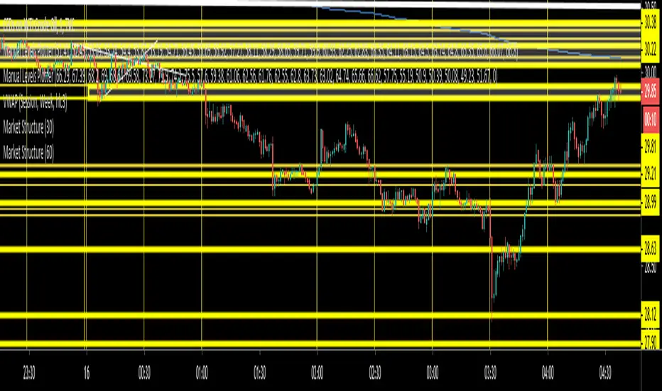
Iconik Trading Suite: Auto Support/Resistance - WeeklyAutogeneration of support and resistance lines. Posts a horizontal line of the open/close for the past 40 weekly candles.
DM for a PowerPoint describing this indicator and the rest of Iconik in detail.
Iconik Trading Suite Indicator List:
ITS-OSC: Oscillators (v2)
ITS-PAA: Price Action Alerts (v2)
ITS-ASR: Auto Support/Resistance
-> Daily (v2)
-> 3 Day (v2)
-> Weekly (v2)
ITS-4TFC: 4 Time Frame Confirmation (v1)
ITS-DIV: Divergence Seeker (v1)

Iconik Trading Suite: Auto Support/Resistance - 3 DayAutogeneration of support and resistance lines. Posts a horizontal line of the open/close for the past 40 3 Day candles.
DM for a PowerPoint describing this indicator and the rest of Iconik in detail.
Iconik Trading Suite Indicator List:
ITS-OSC: Oscillators (v2)
ITS-PAA: Price Action Alerts (v2)
ITS-ASR: Auto Support/Resistance
-> Daily (v2)
-> 3 Day (v2)
-> Weekly (v2)
ITS-4TFC: 4 Time Frame Confirmation (v1)
ITS-DIV: Divergence Seeker (v1)

Iconik Trading Suite: Auto Support/Resistance - DailyAutogeneration of support and resistance lines. Posts a horizontal line of the open/close for the past 40 daily candles.
DM for a PowerPoint describing this indicator and the rest of Iconik in detail.
Iconik Trading Suite Indicator List:
ITS-OSC: Oscillators (v2)
ITS-PAA: Price Action Alerts (v2)
ITS-ASR: Auto Support/Resistance
-> Daily (v2)
-> 3 Day (v2)
-> Weekly (v2)
ITS-4TFC: 4 Time Frame Confirmation (v1)
ITS-DIV: Divergence Seeker (v1)
MS MONEY CCI SQUEEZEAbout
I have used this indicator to find many lucrative opportunities. This indicator takes the moving average of CCI in custom, volatility-specific conditions. CCI measures "overbought" in the red-shaded region and "Oversold" in the green-shaded region. The shaded regions do not constitute a buy/sell signal alone, the MS CCI Squeeze is best used when market conditions agree and is best used when the user has fundamental reasoning for "reversal-like" situations to align. The MS CCI Squeeze will soon have a synergistic partner called "MS RSI Squeeze" indicator that will look similar to help better measure volatility and strength trend.
About the Commodity Channel Index (CCI)
The commodity channel index (CCI) is an oscillator originally introduced by Donald Lambert in 1980. Since its introduction, the indicator has grown in popularity and is now a very common tool for traders in identifying cyclical trends not only in commodities, but also equities (stocks) and currency trading.
How to set an Alert
If the user wants to set an alert , click on one of the support/ resistance lines (black-dashed) near the zero mark. Clicking on the horizontal line above or below the zero line will populate a yellow arrow which will allow you to set alerts when wanted.
Please Read For Better Efficiency
When using this indicator, keep an eye out for harmonic patterns, both bullish and bearish head and shoulders patterns for "HIDDEN" breakout opportunities.
Please like, follow and share and I will continue building better indicators.

MACD PercentageJust the macd not using the raw difference between the 12 and 26 ema for the macd. Instead It calculates the difference in %. Histogram and signal are also derived from the macd line. Also added 2 horizontal lines, you can modify.
Feel free to use and copy the code. I also copied the source code from tradingview public script, thanks to the one who made it.

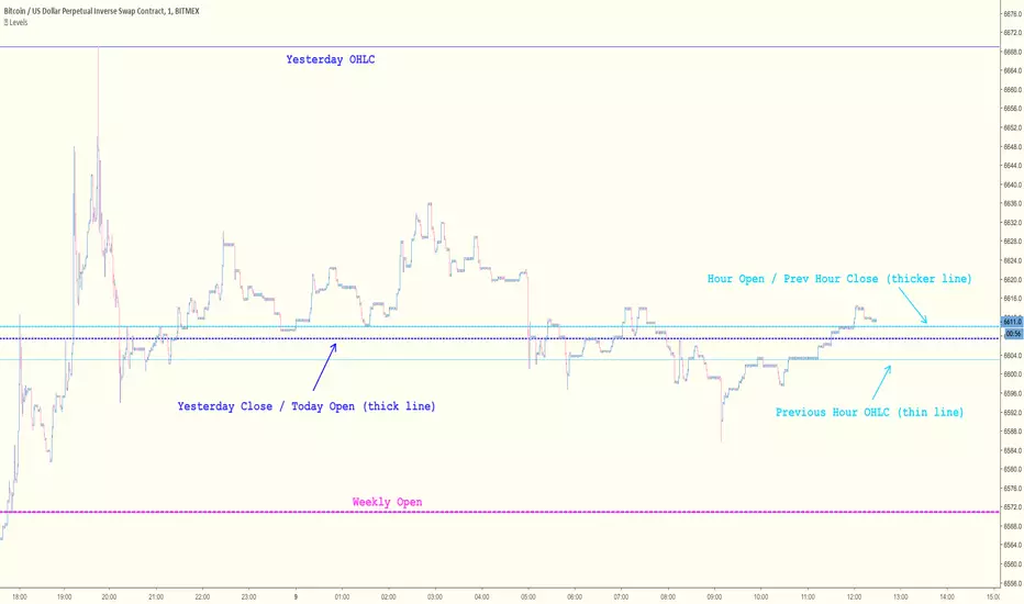
Key Levels [@treypeng]Draws horizontal lines for Daily, Hourly (1) and Weekly levels. Really handy to switch on quickly when scalping.
Light blue: Previous hour OHLC
Thick light blue: Previous hour Close / current hour Open
Dark blue: Yesterday OHLC
Thick dark blue: Yesterday Close / today Open
Purple: Weekly Open
It's a bit ugly, I'd prefer horizontal rays instead of lines stretching back across the chart but I couldn't figure out how to do this in PineScript. If I get it sorted, I'll publish an update.
Pivot S/RThis support/resistance indicator draws a horizontal line at historical Daily swing points.
I've found this to be a very accurate indicator for determining current levels of support and resistance. Double lines and clusters of lines provide particularly strong levels.
Most of the settings are changeable.


Directional Movement Index 4 colors (DMI 4c)It is a normal Directional Movement Index, but instead of using lines for +DI and -DI it uses histogram and 4 colors. It also contains an horizontal line (default value @20) to indicate when a trend is confirmed or not.

Relative Price Difference [LAVA]EDIT: Look below for updates to the script.
EDIT: After several updates to this script, I think it's safe to say it will work with all timelines. Using hand drawn trendlines, it can predict tops and bottoms with pretty good accuracy.
Shows a change in the relative price difference via percentage on a 0 horizontal. Added a bollinger band to help identify weak areas (orange). If orange starts showing, the current price direction is strong but can reverse harshly. If you are in a weak position, exit here. Otherwise, don't enter a trade after/during orange sessions until a full cycle (up/dn > 1% without orange) has completed. The main line indicator fluctuates according to the price difference. 1% horizontal lines are added to help identify profit taking spots or OTE zones. Ensure the 1% line is crossed completely before you decide to enter/exit. Cross points are identified with crosses if you missed your window, this is the last spot to exit, enter. This indicator doesn't work that well with small time intervals. As always, use more than one indicator to ensure your decision is right. (The colors are ugly so change them if you wish! :)
ATH/ATL/DaysThis indicator displays the All-Time High (ATH) and All-Time Low (ATL) — or more precisely, the highest and lowest price within the last N days. It works on any timeframe and uses only local chart data (no security() calls), ensuring stable and accurate results.
It plots horizontal lines for both the ATH and ATL and includes a clean, compact table showing:
Date of the extreme
Days since it occurred
Price
% distance from current price
$ distance from current price
A reliable tool for identifying local extremes, spotting market structure shifts, and tracking short-term price ranges.
Yesterday's OHLC → O | H | L | C with Labels ORIGNAL INDICATOR Yesterday's open, high, low and close BY EduardoMattje AND FULL CREDIT TO HIM
I have only modified with 2 changes
1.Now yesterdays levels are visible from very first candle of any small time frame
2/Labels are also visible of OHLC so it removes confusion for trders
What it does:
Plots yesterday’s Open, High, Low, and Close as horizontal lines on any timeframe (1min, 5min, hourly, daily, etc.).
Lines automatically extend to the right edge of the chart (until the current day ends).
Shows permanent labels on the far right with short prefixes:
O = Yesterday’s Open
H = Yesterday’s High
L = Yesterday’s Low
C = Yesterday’s Close
Key features:
Works perfectly in regular and extended (pre/post-market) sessions
Option to hide the levels on previous days (keeps chart clean)
Very lightweight and fast
No compilation errors
Perfect for day traders who want yesterday’s key levels always visible with clear O/H/L/C labels on the right side of the screen. Just add it once and forget – it updates automatically every day

Yesterday's OHLC → O | H | L | C WITH LabelsORIGNAL INDICATOR Yesterday's open, high, low and close BY EduardoMattje AND FULL CREDIT TO HIM
I have only modified with 2 changes
1.Now yesterdays levels are visible from very first candle of any small time frame
2/Labels are also visible of OHLC so it removes confusion for trders
What it does:
Plots yesterday’s Open, High, Low, and Close as horizontal lines on any timeframe (1min, 5min, hourly, daily, etc.).
Lines automatically extend to the right edge of the chart (until the current day ends).
Shows permanent labels on the far right with short prefixes:
O = Yesterday’s Open
H = Yesterday’s High
L = Yesterday’s Low
C = Yesterday’s Close
Key features:
Works perfectly in regular and extended (pre/post-market) sessions
Option to hide the levels on previous days (keeps chart clean)
Very lightweight and fast
No compilation errors
Perfect for day traders who want yesterday’s key levels always visible with clear O/H/L/C labels on the right side of the screen. Just add it once and forget – it updates automatically every day
Session Breaker with Pivots and VWAP (Arjo)Session Breaker with Pivots and VWAP : A complete intraday trading toolkit in one clean indicator.
This indicator combines four powerful tools that help traders understand intraday bias with clarity and confidence.
It plots the previous day’s last 30-minute high/low box (IST: 15:00–15:30) , the first-hour anchored VWAP (IST: 09:15–10:15) , daily pivot levels , and ATR-based dynamic support/resistance .
Key Features:
• Custom Session High & Low (default 30-min opening range or any session you choose)
→ Visual colored box that instantly changes color when price breaks above the high (cyan) or below the low (purple)
→ The separate darker box shows the exact opening-range boundaries
• Previous Day Classic Pivot Points (PP, BC, TC) + previous session midpoint
→ Clean horizontal lines that auto-update every day
• Morning Session VWAP (default 09:15–10:15 or fully customizable)
→ Perfect reference for early trend strength
• Dynamic Support & Resistance channel based on 20 EMA ± 1×ATR
→ Shaded zones for quick visual context
How to use this tool
//---------------Morning behavior----------------------------
Scenario 1: Opening above previous 30-min high + above 1-hr VWAP
# Institutions were buying heavily in the last 30 minutes yesterday
# Fresh buying continues today above VWAP.
→ Strong bullish continuation day
Scenario 2: Opening inside yesterday's last 30 Mins range + rejecting 1-hr VWAP
# Price keeps oscillating around the first-hour VWAP
No strong buying/selling pressure
→ Expect sideways mean reversion
Scenario 3: Opening below yesterday's last 30-min low but reclaiming 1-hr VWAP.
Then moves towards yesterday’s midpoint or even high.
# Overnight panic selling is absorbed by institutions, then the market reverses. This is a high-probability reversal.
→ Short-covering rally
Scenario 4: Gap up into yesterday's last 30 Mins high and failing 1-hour VWAP
→ Ideal countertrend short.
Scenario 5: Opening below yesterday's last 30-minute low + below 1-hour VWAP
# Aggressive selling
# Staying below VWAP = no buyer strength
#Institutions are selling rallies into VWAP
→ Strong bearish continuation day
In Short:
1. Price opens ABOVE previous 30-min HIGH + stays ABOVE VWAP → TREND DAY UP
2. Price opens INSIDE the previous 30-min range + hovers around VWAP → RANGE / MEAN REVERSION DAY
3. Price opens BELOW previous 30-min LOW + reclaims VWAP → REVERSAL DAY UP (Short-Covering or Short Trap)
4. Gap up opens ABOVE previous 30-min HIGH + failing 1-hr VWAP → Countertrend short.
5. Price opens BELOW previous 30-min LOW + stays BELOW VWAP → TREND DAY DOWN
Disclaimer
This indicator is an analytical and educational tool . It does not provide buy/sell signals. Users may combine these concepts with their own trading approach and risk management.
Happy trading, ARJO.
ueuito VWAP + VWAP Previous Day EndThis script is a fully featured VWAP indicator, based on the standard Volume-Weighted Average Price formula used by professional traders. It calculates the VWAP anchored to the selected period and also provides optional standard deviation or percentage-based bands.
In addition to the traditional VWAP logic, this version introduces an important enhancement:
⭐ Previous Day VWAP Closing Line (New Feature)
The script automatically calculates the final VWAP value of the previous trading day and plots it as a horizontal line at the start of each new session.
This line remains visible throughout the current day, allowing traders to quickly identify where the market closed relative to the VWAP on the prior day.
This added feature provides several advantages:
Highlights a key institutional reference level that is often used for mean-reversion setups.
Allows intraday traders to compare current price action with the previous session’s VWAP benchmark.
Helps identify support/resistance behavior around the prior VWAP close.
The line is customizable with options for:
Color
Width
Style (solid, dashed, dotted)
On/off toggle
✔ Summary of Features
Standard VWAP calculation with optional session or custom anchors
Three optional VWAP bands (standard deviation or percentage based)
Fully configurable appearance settings
Previous Day VWAP Closing Line added as a key enhancement
Works on any intraday timeframe
Automatically resets at the start of each trading session
